Hello! Did you know that the font types you choose for your designs can speak and give information about your work to others? If this has never even crossed your mind before, we’re here to tell you.
Hello! Did you know that the font types you choose for your designs can speak and give information about your work to others? If this has never even crossed your mind before, we’re here to tell you.
Yes! Fonts can talk!
Just as every region has its own language, fonts also speak different languages depending on their geography — that is, their industry. The languages they speak can shape how consumers perceive a brand, and when used correctly with the right elements, they can easily convey the distinction between industries to potential customers. For example, the book covers published by Pegasus Publishing, with their unique typography for each series, practically shout, “I’m here!” and stand out among other publishers’ books, creating a strong desire to buy. Cheetos, which has become a global brand in the food industry, follows a similar approach to Pegasus’s publishing strategy. That’s why, if someone were to ask us to name a chips brand that features an energetic combination of yellow and orange, we would instantly point to Cheetos. Cheetos succeeded in uniting the product and the consumer by using its font with the right elements.
Even in the brief analysis above, we can directly notice the clear difference between the “languages” of fonts used in two different sectors, because fonts not only speak — they also express themselves through emotions.
For example, serif fonts — those with decorative strokes — evoke feelings of respect, trust, and elegance, while sans serif fonts convey simplicity, minimalism, and comfort; and script fonts evoke feelings of trendiness, sophistication, and romance.
Now, fonts are not just materials used in web or graphic design — they often form the very core of a design. Take a few seconds to focus on them and notice the feelings they evoke in you. You’ll realize how some feel so cool while others give off a bohemian vibe.
The notorious COMIC SANS font, which almost everyone wrinkles their nose at, is a painful example of this. We can see how much people hated this font from the petition once organized on bancomicsans.com to have Comic Sans removed from history. The main reason this situation escalated was that, although the font was originally designed to be fun for children and helpful for people with dyslexia, it began to be used in formal sectors as well.
From this, we can easily draw a conclusion: if one lacks sufficient knowledge, just as we can’t expect a person who speaks Turkish to communicate effectively in a region where everyone speaks Dutch, we also can’t expect a font to convey the same meaning across two completely different industries.
Of course, this isn’t always the case, as seen with Comic Sans. For instance, the automobile brand Jeep and the sportswear brand Kappa, though operating in completely different industries, both use Helvetica, a sans serif font, and have succeeded in communicating effectively in different ways. Have you ever thought about why? Undoubtedly, the biggest reason behind their success, despite being founded in very different eras, is that they have kept up with changing times and followed trends. Because when it comes to adapting to the era, trends can change faster than you might imagine — and we are also expected to keep up.
Therefore, rather than viewing the issue as simply “This font group belongs to this industry,” it’s more accurate to approach it as “Does this font, which I believe suits my industry, resonate with the spirit of the times?”
Of course, creating an impressive piece of work while paying attention to all these criteria can be quite challenging. In fact, to avoid the risk of mistakes, many brands use fonts that are suitable for almost every industry. As Bluport, we’ve compiled a few of these versatile fonts for you — here are the ones that fit any sector without risk:
- SF Pro
- TT Norms
- Bison
- Soin Sans Neue
- Vanguard CD
In essence: when you use the right font, in the right place, at the right time, and for the right audience, that font can become not just your brand’s symbol, but its very character. In fact, as with the miracle of the GOTHAM font contributing to Obama’s election as the President of the United States, it could even lead to historic achievements beyond imagination.
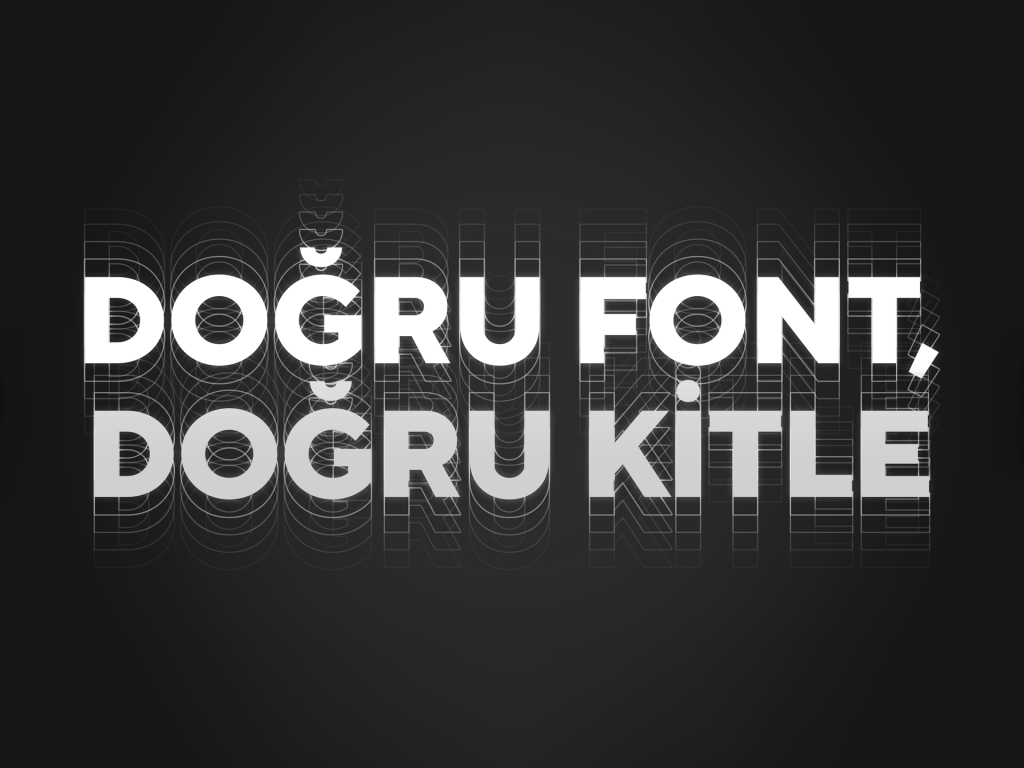
If you’re among those aiming for quality in your industry, as an agency that captures the spirit of the times — we’re here with the RIGHT FONTS.